

I.have tried several systems for improving my focus while working remotely over the 20 years, here is the latest one that works very well. Unlike classic Pomodoro system it doesn’t ring and doesn’t limit you by the pre-set time. If you are in a flow state – you are not distracted by the need for ‘break’. This system is using analogue Chess clock. I start day at 12.00 on both clocks. Left side clock represent distractions, breaks – my oponent. Right side clock represents my focus work. Any time I do breaks or I am distracted I need to punch the upper button – there is actually joy doing this with my special Karate-like super-fast clock switch technique. The clock is robust enough to sustain my punching. Also at each hour passed on the right clock I hear clearly rustle of the red flag indicating it – kind of satisfying and not distracting. At the end of the day I can clearly see who is the winner and total amount of time spent by work. Oh no, writing blog is actually distraction, back to focused work, “punch” – it ticks better now 🙂 Enjoy.

Spuštěno vysoké rozlišení pro mapy iKatastr.cz, při použití retina obrazovky (tj 4K nebo obdobných vysokých rozlišení) se mapa katastru zobrazuje ve vyšším rozlišení


Mimo to bylo spuštěno rychlejší načítání katastrálních území i odkazů na úřady katastrálních pracovišť. To výrazně zrychluje vyhodnocení dotazů. Dále opravena chyba s načítáním vrstvy polohového bodového pole a chytřejší inicializace povodňových map. Pravé menu spolu s linkami na služby je možné schovat.

Mimo to bylo spuštěno rychlejší načítání katastrálních území i odkazů na úřady katastrálních pracovišť. To výrazně zrychluje vyhodnocení dotazů. Dále opravena chyba s načítáním vrstvy polohového bodového pole a chytřejší inicializace povodňových map. Pravé menu spolu s linkami na služby je možné schovat.

Nově přibylo propojení na navazující služby myNEMO report – pro ověření nemovitosti a FerMakleri pro prodej nemovitosti. Obě služby jedou v pilotním ověřovacím provozu. Kliknutím na parcelu se v případě myNEMO report propíše číslo parcely do tlačítka v pravém horním panelu – po kliknutí nemusíte znovu vyplňovat údaje na protější straně.
update 07/2025: Olympus Pen-D post.
What a nice half-frame camera from 1960ties. I think one of the best, even better than Olympus PEN I think as it doesn’t stop you from doing ‘wrong’ shots and the viewfinder shows auto-selected speeds. It is light-weight, pleasant to hold, small enough.


View finder is beautiful, needle is not visible enough but is moving by iteself – no need to press shutter button. When in blue area and lens are set to ‘blue’ 3 meters as well the focus is guaranteed to be OK on anything from 3 meter to infinity.
More photos from Canon Demi EE28 also here: https://blog.sumbera.com/composed/
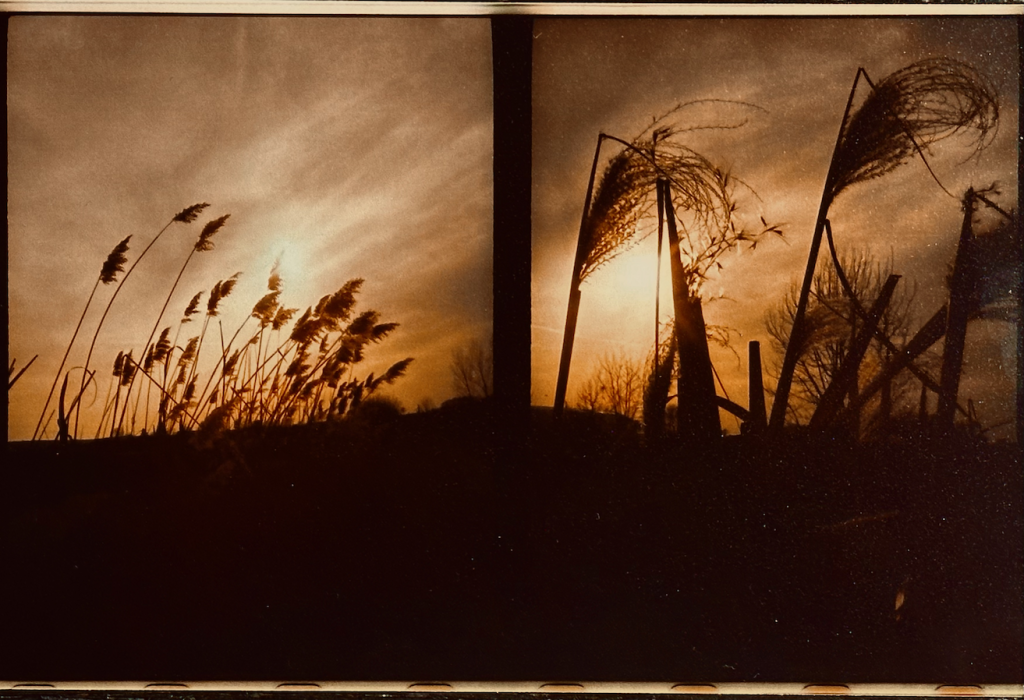
Here is recent suprising photo from the camera, no post processing, actually its digitalised form here is worse than real picture.
 Hyper self-digitalization is not healthy like any other extreme, this is my observation, there are ways how to reduce it and since this is very new area of research it will take cca another decade to educate society on digital hygiene. Meanwhile there are already some good books available – Cal Newport’s Book : “Digital Minimalism”.
One of my first attempt was in 2013 so time to renew the effort.
Here is my “analogue” / d.minimal / non electronic arsenal:
Another aspect to compensate “hyperdigitalisation” is workouts – I could finish 90 days challenge by Mark Lauren and can continue with his “You are Your Own Gym” workouts.

 When dynamic maps were in early stages of development or even concepts, I was thinking on ‘replay’ function – sort of step-sequencing based on certain dimension. Some of these ideas have been presented in the “Incident Prototype” in 2014 here at 2:24 where you can see sequencing over the day or month period.
Another demonstration took place in Green Space Analyzer in 2015 when introducing Smart M.Apps at 2:04 when years are sequenced.
Important part of the idea was the editing functionality – or how the sequence and capture ‘user motion’ in general. In multidimensional data there are nearly unlimited number of combinations and ways how data are filtered over the time. However instead of continuous time sequencing, we can simplify to ‘step-sequencing’ that is well known in music industry – many digital instruments offer this, specially rhythm, drum or groove machines. Geospatial industry could take a lot from looking on how this function, core to music production, is done there and get inspiration for smart mapping.
For example Korg Minilogue xd captures ‘user motion’ of the filters that can be defined for each of the 16 steps
Why it is important – imagine story telling where someone will show how to filter out data to get certain interesting results – he will then save his choices of filters over the time (in form of motion sequence) so other people can load it and ‘replay’ it and further tweak it.
I believe this might be super-useful for show-case of evolving of some phenomena, or how someone (aka expert) got into certain results.
Or it might be useful as ‘Smart Video’ of maps – so instead of publishing dump video – you publish a dynamic map plus ‘motion sequence’ of when and what is filtered (including map manipulations like zooms)
Yeah this is like what everyone knows from Whether forecasts – replay or forecast of cloud/pressure/wind motion, however instead of video, you get real smart map – the one that is replaying its state based on the sequencer data.
State of state
Keeping current state of the filters modified by user is the first step.
While lot of user interaction already happens on the client side, most of the front -leading solutions do not keep a state of the selected filters so refreshing URL doesn’t keep what user has previously selected – in short all user UI state is lost. May be this is ‘feature’ to reset state not inconsistency, then you need to make another button that explicitly gives you link to the current state…
In iKatastr.cz I keep the state in URL – this makes it easy than to go forward/backward of what user has previously selected (here parcel). Moreover it enables direct link sharing and one button less in UI (for sharing link) – so what user sets in UI on the page is reflected in the URL as fragment (starting by #) so any time user can grab the URL and pass it by SMS or email – this plays well on iOS/Android with default ‘share url’ function of the browsers. So try this link: https://ikatastr.cz/#kde=49.31166,17.75353,18&mapa=zakladni&vrstvy=parcelybudovy&info=49.31142,17.75423
and try to refresh it – you will see the same state as before the refresh. You can also try to select other parcels and then press back button in the browser. You can experience back/forward ‘sequencing’ manual sequencing fo your previous user interactions. This is most likely the way to go and further evolve into full step-sequencing.
pozn. 12/2024: vrstvy starých cenových map byly odebrány a nahrazeny vrstvami leteckých snímků s minulých let – viz video zde.

Na iKatastr.cz přibyly nové vrstvy cenových map pro 3 města – Praha, Ostrava, Olomouc. Najdete je ve vrstvách, v kategorii “cenové mapy”. K jiným městům se zatím napodařilo data získat . Vyzkoušejte.

Vrstvy jsou nově na ikatastr.cz uspořádány do kategorií, tak aby se daly postupně přidávat nové a zároveň nebyl uživatel přehlcen záplavou možností. Cca 5 vrstev na kategori.Na URL odkaz nemá tato funkce vliv, tj. v URL odkazu se kategorie nepouživají.
Nově jsou přepracovány věcná břemena, které mají samostatnou kategorii, kde lze jednotlivé typy břemen přepínat.

Přidány byly také záplavové mapy pro 5 a 100 letou vodu.
Pokud máte tip na další kategorie a mapové zdroje, prosím napište.
Územní plánování a jeho nejednotnost je bohužel stav i v roce 2019, alespoň lze nyní odkazem v okně “info z katastru nemovitostí” přejít na příslušnou stránku obce, která územní plány vystavuje.
Pokud vám link chybí a znáte jej pro danou obec, dejte mi prosím vědět a doplním jej.

Update 02/23: here is better picture:

Linear transformation in 3D graphics can be tricky, here is as “Matrix Cycle” that should help to better understand transition between spaces. The tricky part is actual numerical representation (or direction) in the transformation matrix. Some info about also here (nice notation of actual numerical matrix direction) nice online demo here


following picture is from :http://antongerdelan.net/opengl/raycasting.html

other references:
from Model to Screen: https://stackoverflow.com/questions/46008171/transform-the-modelmatrix/46008573#46008573)

bug notes: ...frame.capturedImage in iOS 12.1 started to show green lines and wrong video frame. Fix was to take real CVPixelBufferGetBytesPerRowOfPlane instead ofCVPixelBufferGetWidth and stretch image with UV coords based on the difference between the two. https://lists.freedesktop.org/archives/gstreamer-devel/2012-November/037921.htmlBoth the stride (bytes of padding added to each row), as well as the extended rows (rows of padding at the bottom or top of the buffer) are important. The extended rows are what changed in iOS6; you can find out how many rows of padding are added to the buffer using: CVPixelBufferGetExtendedPixels(pixelBuffer, &columnsLeft, &columnsRight, &rowsTop, &rowsBottom)
In the example you gave (Medium preset on iOS6) you should be seeingrowsBottom = 8.

The stride is effectively CVPixelBufferGetBytesPerRowOfPlane() and includes
padding (if any).
When no padding is present CVPixelBufferGetBytesPerRowOfPlane() will be
equal to CVPixelBufferGetWidth(), otherwise it'll be greater.
